
Design
Branding, logo and visual identity
We build the visual system of a brand: positioning and naming through to logo, palette, typography and a brand book any future contractor can work from. You get vector source files, not just a PNG on a white background. We work with new companies and with rebrands, where an identity exists but has stopped doing its job.
- Pricing
- From $70 · ≈ 5,000 ₽
- Timeline
- A single ad layout takes 1 to 2 days. A logo with its base lock-ups takes 5 to 10 working days. A full identity with palette, typography and applications runs 3 to 4 weeks. A complete brand book with print and social rollout takes 5 to 7 weeks. A rebrand with a transition plan starts at 6 weeks.
A starting price. The total depends on scope, integrations and deadlines.
In short
Branding covers positioning, verbal identity and a visual system, not just a logo. A working identity package includes the logo in 3 to 4 lock-ups (primary, horizontal, symbol, monochrome), a palette with HEX, RGB, CMYK and Pantone values, two or three typefaces with a size scale, and rules for clear space and minimum size. Source files come as AI, SVG, EPS, PDF and PNG. A single layout starts at 5,000 RUB, an identity at 40,000 RUB, a full brand book at 120,000 RUB.
What branding is made of
The order of work is almost always the same: positioning, verbal identity, logo, palette and typography, brand book, rollout onto real materials. Skipping the first step is tempting, but it is the step that explains why the mark looks the way it does. Without it the conversation collapses into personal taste about the colour blue and the project becomes a guessing game.
Positioning for us means a few pages of specifics, not philosophy: who we sell to, how we differ from the three nearest competitors, which words should be used about the company and which ones must never appear. The verbal side covers naming (if there is none yet), a check on domain availability and similar registered trademarks, a tone of voice, and a short vocabulary for the site and social accounts.
- Positioning: audience, differentiators, brand promise, words to avoid.
- Verbal identity: naming, tone of voice, key phrasings, a tagline when it is needed.
- Logo: symbol, wordmark, lock-ups, clear space, minimum sizes.
- Style constants: palette, typography, patterns, icons, photography direction.
- Applications: social profiles, deck, business cards, packaging, signage, merch, ad layouts.
The logo: what you actually receive
A logo is not one file, it is a set of versions for different situations. A primary stacked lock-up for the site and decks, a horizontal one for headers and signage, a standalone symbol for avatars and favicons, monochrome versions for single-colour print, and an inverted version for dark backgrounds. Plus the rules: how much clear space it needs, how small it can go and stay legible, and what must never be done to it.
Formats arrive as a complete set: AI and EPS as editable sources with outlined type, SVG for web, PDF for print production, PNG with transparency in several sizes, and ICO or SVG for the favicon. Type inside a logo is always converted to outlines so nothing shifts when a contractor lacks the font. If a typeface licence does not permit commercial use, we raise it before approval rather than after.
We never present a logo in a vacuum. It is shown in use straight away: at 40 by 40 px as an avatar, on signage, on packaging, on white and on dark, and in black and white. A mark that looks lovely on a blank canvas and falls apart as an avatar is an illustration, not a logo.
What a real brand book contains
A brand book exists for exactly one reason: so the identity survives a change of designer, agency or print shop. That is why it is built from rules and source files rather than decorative spreads. A practical size is 30 to 60 PDF pages plus a folder of files. Anything longer usually goes unopened after the first week.
The mandatory core: logo versions and clear space; forbidden modifications shown as examples; a palette with exact HEX, RGB, CMYK and Pantone values plus usage proportions; typography with families, weights, sizes and line heights; grid and spacing module; rules for photography and illustration; icons and patterns; and finished examples on real applications.
The PDF always ships with a working kit: vector logo sources, font files or licence links, a presentation template in PowerPoint or Google Slides, post templates in Figma or Canva, and print layouts set in CMYK with 3 mm bleed. That folder is what saves money a year later when someone needs a banner by tomorrow.
Rollout: social, ads and print
An identity only comes alive on real materials. The launch set covers covers and avatars for social profiles, post and story templates at 1080 by 1350 and 1080 by 1920, a site header, a deck, a business card and an email signature. Retail adds price tags, signage, packaging and stickers; e-commerce adds product imagery and marketplace banners.
Ad creatives follow different rules from image material: platform limits on text share, safe zones for interface overlays, and legibility down to 320 px wide. We produce them in sets of 3 to 5 variants per campaign so a media buyer can compare creatives instead of running a single layout until it burns out.
Print is prepared separately: CMYK instead of RGB, 3 mm bleed, 300 dpi, outlined type, and a separate preview PDF for approval. We clear the file with the specific printer before sending, because each one has its own colour profile and finishing requirements.
Rebranding: when to change and when to repair
A full rebrand is justified when the company itself changes: a new market, a new audience, a merger, an exit from a niche, or a trademark conflict. If the actual problem is that the logo is unreadable as an avatar, the palette dies on dark backgrounds and every layout is made by a different freelancer, then what you need is not a rebrand but order: a restyle plus a brand book.
A restyle keeps recognition and costs noticeably less: the mark gets cleaned up, proportions and colour are brought to sane values, and the missing versions and rules are added. Changing the name and the mark outright also needs a transition plan, because the site, signage, documents, packaging, social profiles and ads cannot all switch on one day, and the sequence matters.
What the work includes
- A short positioning document: audience, differentiators, brand promise, words to avoid
- Moodboard and one or two visual directions before the final artwork
- Logo in 3 to 4 lock-ups: primary, horizontal, symbol, monochrome and inverted
- Source files in AI, EPS, SVG, PDF and PNG with transparency, type outlined
- Palette with HEX, RGB, CMYK and Pantone values plus usage proportions
- Typography: families, weights, size scale, line heights and licence links
- A 30 to 60 page brand book in PDF with rules and applied examples
- Templates for applications: social, deck, business card, email signature, ad creatives
- Print-ready CMYK layouts with 3 mm bleed, cleared with the printer
How we work
- 01
Brief and positioning
We work through the business, the audience and the three closest competitors, then fix the brand promise and the words to avoid. That document later settles taste arguments, because the question becomes whether something works, not whether someone likes it.
- 02
Moodboard and directions
References are gathered and one or two visual directions are shown: the character of the forms, colour, typography. The direction gets approved before any logo is drawn.
- 03
Logo and lock-ups
The mark is drawn in vector and tested at 40 by 40 px, on signage, on dark backgrounds and in single colour. All lock-ups and clear space rules are assembled.
- 04
Style constants
We lock the palette with exact screen and print values, pick typefaces with their licences checked, and add patterns, icons and photography principles.
- 05
Brand book and rollout
We assemble the rules PDF and the source folder, then build templates for social, decks and print. Where it helps, we stay on to support the first campaign.
Technology and tools
- Adobe Illustrator
- Adobe Photoshop
- Adobe InDesign
- Figma
- FigJam
- Pantone Connect
- Adobe Fonts
- Google Fonts
- Midjourney
Selected work
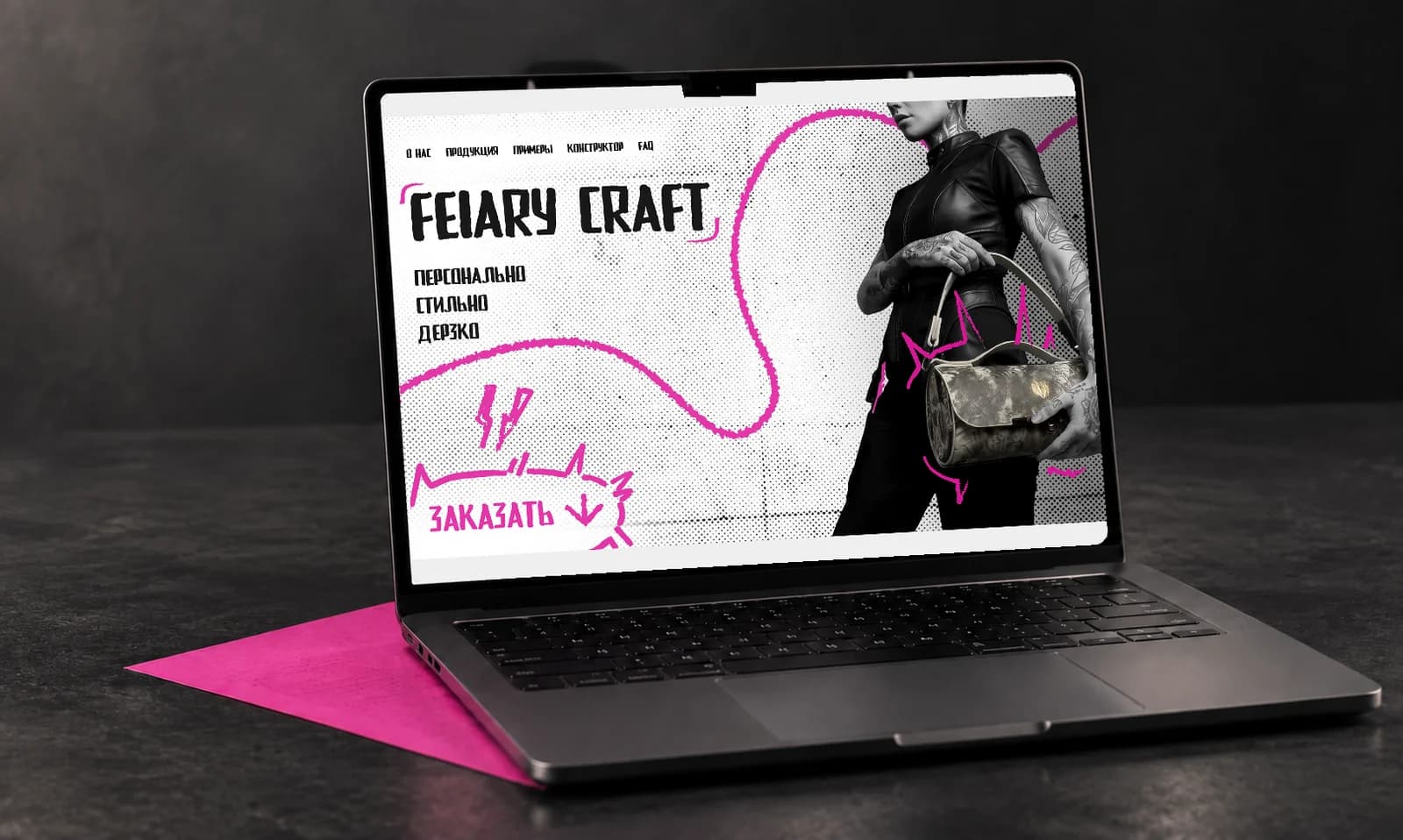
FEIARY Craft
Design for a leather accessories store. The style echoes street and tattoo art to tie the products to a bold youth aesthetic, while the palette signals premium quality. Built by Veltos.Tech together with Makar.
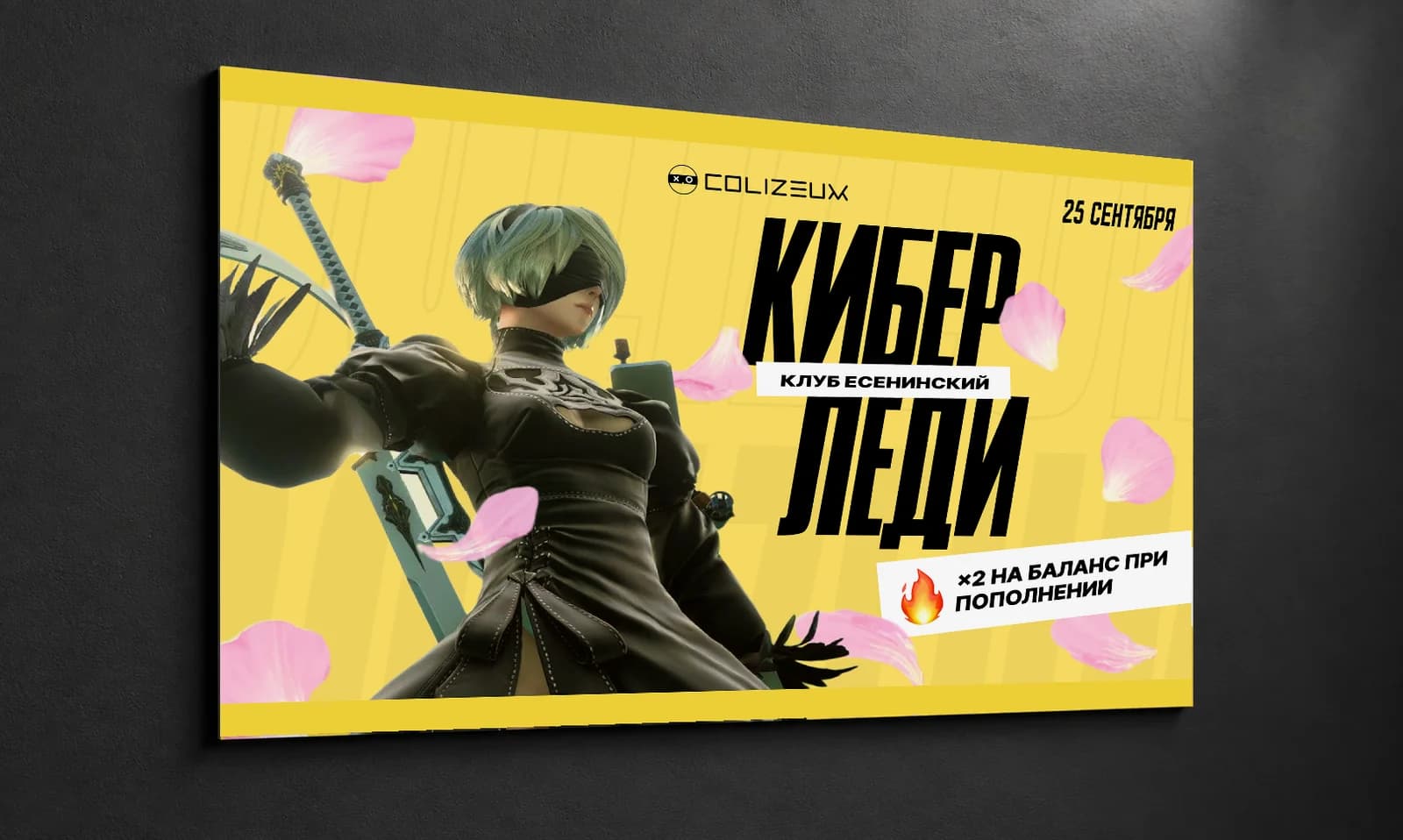
Cyber Lady
Posters for the Colizeum network of esports clubs and arenas. A dedicated banner with promotions for International Women’s Day — warm yellow and pink tones evoke femininity and a welcoming feel inside the club.
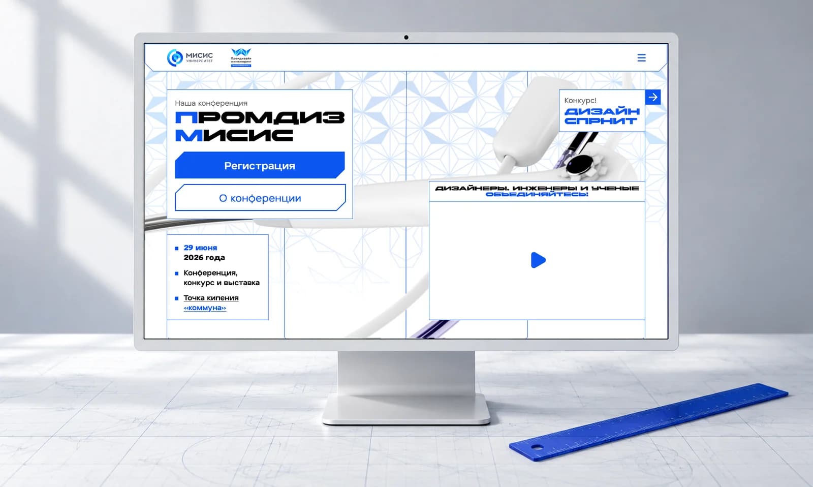
Promdiz MISiS
A redesign for NITU MISIS. The Industrial Design department’s “Design Sprint” site was rebranded to blend engineering blueprints with modern tech — a layout that feels drawn with a ruler and dotted with editing pop-ups.
Frequently asked questions
How much does logo design cost?
A single layout in our price list starts at 5,000 RUB, a logo with its base lock-ups and rules at 40,000 RUB, a full identity with palette, typography and applications at 80,000 RUB, and a complete brand book at 120,000 RUB. The difference is not drawing hours, it is depth: positioning work, how many concepts get tested, how many applications are produced, and whether documentation exists. A 5,000 RUB logo is real, but it means one concept with no research and no brand book.
What goes into a brand book, and how is it different from guidelines?
Guidelines are the visual rules: logo, clear space, palette, typography, grid, forbidden modifications. A brand book is broader, adding positioning, tone of voice, photography and illustration principles, and finished examples on real materials. In practice what a client needs is a working kit: a 30 to 60 page PDF plus a folder with vector sources, fonts, deck templates and CMYK print layouts. Without that folder even the most beautiful PDF is useless.
Who owns the logo, and can you help with trademark registration?
Exclusive rights transfer to the client by contract along with the source files, so you can use the logo on any material and hand it to other contractors. We also prepare the file set needed for a trademark application: the image at the required resolution, a black and white version, and a colour description. The registration itself is handled by a trademark attorney, a separate process with its own fees and a timeline of roughly 8 to 12 months. A preliminary similarity check happens during naming.
How many logo concepts do you present?
Usually two developed concepts rather than ten sketches. Each one is shown in use immediately: at 40 by 40 px as an avatar, on signage, on packaging, on dark backgrounds and in single colour. That format is more honest, because a mark that wins on a slide often falls apart at real size. The chosen direction then goes through two rounds of revisions. If neither concept lands, we trace the reason back to the positioning document and produce a third at no extra cost.
When do you need a rebrand instead of a refresh?
A rebrand is justified by a change of market, audience or name, by a merger, or by a trademark conflict. If the real symptoms are a logo that dies at small sizes, a palette that fails on dark backgrounds and layouts made by a different person every time, the idea is not the problem, the absence of a system is. A restyle is then far cheaper: clean up the form, fix colour and proportions, add the missing versions and a brand book. Recognition survives and the budget differs by a wide margin.
Can I order just ad creatives without a full branding project?
Yes, and it is the most common request. We take an existing style or references and produce a set of layouts for the campaign: 3 to 5 variants per angle at 1080 by 1080, 1080 by 1350 and 1080 by 1920 for social, plus banners for ad platforms and print files where needed. Pricing starts at 5,000 RUB per layout and drops with volume. If no style exists at all, we first lock a minimal set of constants, palette, typeface and logo, otherwise every campaign looks like a different company.
Want to talk it through?
Tell us what needs building. We will work through the task, propose an approach and send a staged estimate. No charge, no commitment.
Related services
- UX/UI design for websites and appsWe design interfaces that survive contact with production: research, structure, UI kit and a clean handoff to the developers. Everything lives in Figma as components with real states and real breakpoints, not as a folder of flat mockups. The same process covers landing pages, corporate sites, e-commerce, web apps and mobile.
- Motion design and AI video for adsWe produce short video ads: shots generated with AI models, motion graphics on top, then edit, grade and sound design. You get a 16:9 master plus reframed 9:16 and 1:1 cuts, ready to upload to social feeds, Reels, Shorts, marketplace listings and ad accounts. We are straightforward about where AI delivers in a day and where filming or hand-built animation is still the right answer.
- Landing page developmentOne page, one goal: the enquiry. We build the landing around a specific offer and the traffic you plan to send at it, whether that is search ads, paid social, organic or email.
- SMM and social media managementSocial media stopped being a place where posting regularly is enough. In Russia two platforms are left standing, Telegram and VK, and each distributes content by its own rules: Telegram has no algorithmic feed and almost no organic growth, while VK hands out reach through short video and recommendations. We build the work around that reality: strategy, content pillars, a steady production rhythm and metrics that mean something.
Terms used on this page
Further reading
- Branding for a Startup: The Minimum Set at Launch and What It CostsStudios sell 200-page brandbooks while a startup needs a set that fits in one PDF and lets you launch ads next week. The minimum scope, staged payment, market prices and the legal step almost everybody skips.
- Design Systems: When They Pay Off and When They Are an Expensive ToyMost teams asking for a design system need a component library and naming discipline instead. Where the line sits, how to calculate the payback before you start, and what actually belongs in a minimum viable version.
- How to Choose a Development Contractor: The Question List and the Red FlagsA practical guide to choosing a development vendor: who needs a freelancer and who needs an integrator, the 25 questions for the first call, how to verify portfolio cases and what belongs in the contract.