
Design
UX/UI design for websites and apps
We design interfaces that survive contact with production: research, structure, UI kit and a clean handoff to the developers. Everything lives in Figma as components with real states and real breakpoints, not as a folder of flat mockups. The same process covers landing pages, corporate sites, e-commerce, web apps and mobile.
- Pricing
- From $280 · ≈ 20,000 ₽
- Timeline
- A landing page takes 2 to 3 weeks, a corporate site or online store 4 to 6 weeks, a web or mobile app interface 6 to 10 weeks. A design system for an existing product runs 3 to 5 weeks and usually happens alongside development.
A starting price. The total depends on scope, integrations and deadlines.
In short
UX/UI design is research, structure, interface and a design system, not a single pretty mockup. We deliver the core screens at three breakpoints (360, 768 and 1440 px), a component library covering hover, focus, error, loading and empty states, and a Figma file a developer can build from without guessing. Landing pages take about 3 weeks, products 6 to 8. Prices start at 60,000 RUB.
What UX/UI design includes
The UX half answers what a person sees and in what order: screen map, scenarios, block sequence, form logic and error handling. The UI half answers how it looks and feels: grid, typography, colour, icons, states, micro-animation. Splitting them is a false economy. A logical but bland screen does not build trust, and a beautiful one with muddled structure does not produce leads.
A standard project runs through five stages: research, wireframes, visual concept, UI kit and design system, handoff with build support. On a landing page those stages compress into two or three weeks; on a product with a user account area they stretch to two months. The order does not change.
- Research: a pass over competitors ranking for your queries, a working session with your team, and a read of existing analytics and session recordings if the site is already live.
- Structure: screen map, low-fidelity wireframes, and step-by-step scenarios for the actions that matter: purchase, request, signup, payment.
- Visual concept: one or two directions shown on the main screen so the style is agreed before the whole project gets drawn.
- UI kit: buttons, inputs, selects, cards, tables, modals and toasts, each with its full set of states.
- Handoff: a file built on Auto Layout and variables, with named layers and laid-out breakpoints, plus a walkthrough call with the developers.
Why some designs ship and others stay in Figma
A mockup shows the happy path: a short product name, an avatar that loaded, three items in a list, a button with exactly two words in it. Production is a three-line product name, a missing photo, an empty list, a failed payment and an 87 percent discount badge. A design that ships contains those cases up front, so the developer is not inventing them alone on the last day of the sprint.
The second dividing line is componentisation. If every button is drawn by hand, the file drifts away from production after the first round of edits, and a month later nobody knows which version is true. If the button is a component with variants, one edit fixes every screen at once and the developer sees the same set of variants mirrored in code.
The third is real content. We ask for actual copy, photography and data as early as possible. Lorem ipsum hides half of the interface problems and creates the illusion that a layout is finished.
Design system: tokens, components, UI kit
A design system is not a premium add-on for large companies, it is how you avoid building the same project twice. It starts with tokens: colours, a type scale, spacing on a 4 or 8 pixel step, radii, shadows, elevation levels. They live in Figma Variables and map to CSS custom properties or a Tailwind config on the code side, so changing an accent colour takes minutes instead of a day.
The UI kit sits on top of those tokens: atomic elements first, then composite blocks (header, product card, request form, order table), then page templates. Every component gets variants and states rather than twenty hand-edited copies. A small site usually needs 25 to 40 components; a customer account area or marketplace typically runs 80 to 150.
Documentation stays short and practical: when to use a primary button versus a secondary one, the minimum width of a card, what happens when a heading does not fit. We do not produce a hundred-page PDF that nobody will open.
Breakpoints, accessibility and developer handoff
The default set is 360 px for mobile, 768 for tablet and 1440 for desktop, with 1920 added for wide dashboards. We do not simply squeeze the desktop layout. Each breakpoint is resolved on its own terms: what gets hidden, what becomes a horizontal scroller, where a table turns into a list of cards, and where the primary action button moves on a phone.
On accessibility we hold a working minimum: text contrast of at least 4.5:1, touch targets from 44 by 44 px, a visible focus state on every interactive element, and a sane tab order through forms. This is not a WCAG certification, but it is the part that genuinely affects conversion and anyone using a phone in daylight.
Handoff includes a clickable prototype for sign-off, exported assets in SVG and WebP, spacing specs available through Dev Mode, and a call with the build team. We stay reachable while the front end is assembled, because the question of how something should behave at 900 px always comes up.
What website design costs and what drives the price
Pricing follows the number of unique screens and the depth of work, not the number of pages on the site. A catalogue of 500 products is one card template, not 500 mockups. As a guide: landing page from 60,000 RUB, corporate site or online store from 120,000 RUB, web app or account area interface from 250,000 RUB, a standalone design system for an existing product from 180,000 RUB.
What pushes the estimate up: several user roles with different permissions, complex tables and filters, multiple languages, custom illustration or 3D, and a dark theme. What pulls it down: an existing brand book, copy and photography ready before we start, and leaning on a proven component library instead of a fully bespoke interface.
What the work includes
- Screen map and low-fidelity wireframes for the key scenarios
- Finished layouts for every unique screen at 360, 768 and 1440 px
- UI kit: components with variants and states (hover, focus, error, loading, empty, disabled)
- Tokens in Figma Variables: colour, typography, spacing, radii, shadows
- Clickable prototype of the main path for sign-off and demos
- Icons and graphics in SVG, images in WebP with declared dimensions
- A short spec of the rules: grid, scale, block behaviour at each width
- Dev Mode handoff and support for the build team through release
How we work
- 01
Kickoff and research
We unpack the goal, the audience and the target action, review the competitors ranking for your queries and read existing analytics if the site is live. The output is a prioritised screen list, not an abstract brief.
- 02
Structure and wireframes
Block order and navigation logic get built as black-and-white wireframes. Arguments are cheap at this stage: changes take hours rather than days.
- 03
Visual concept
We show one or two directions on the main screen: colour, typography, character. The style is signed off before the rest of the project is drawn.
- 04
Screens and UI kit
The remaining screens are drawn while components, states and breakpoints are assembled in parallel. Progress is shown every few days, not once at the end.
- 05
Handoff and build support
We hand over the file, assets and prototype, run a call with the developers and stay available during the build. Edge cases are pinned inside the layout itself rather than buried in chat.
Technology and tools
- Figma
- FigJam
- Figma Variables
- Auto Layout
- Figma Dev Mode
- Tokens Studio
- Storybook
- Yandex Metrica
- Maze
- Adobe Illustrator
Selected work
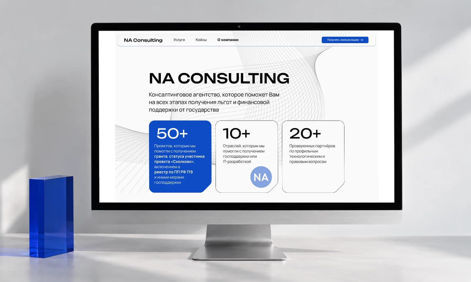
NA Consulting
A website for the NA Consulting agency. An interactive landing page packs the full story of the agency and its services into a minimalist layout. Calm colours convey trust and professionalism. Built by Veltos.Tech together with Aliya (finnikkis.github.io/maulaviyevadesign).
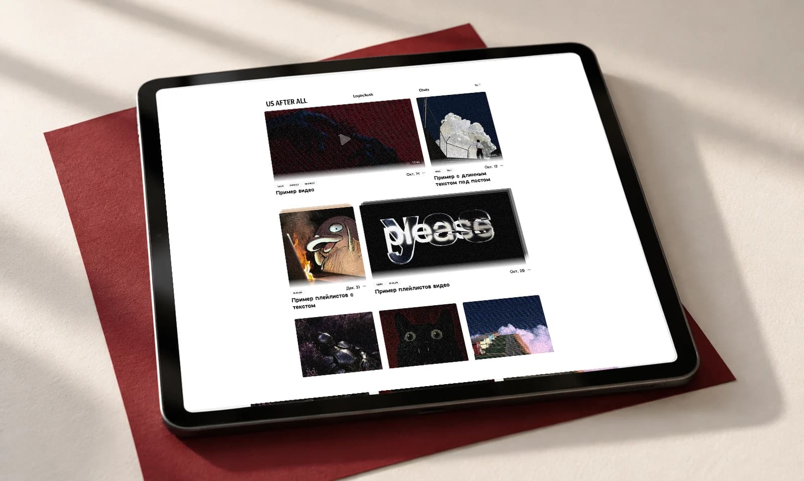
Us After All
A website for the Us After All news agency — a simple, minimalist daily news hub with articles, video, audiobooks and full playlists in one place.
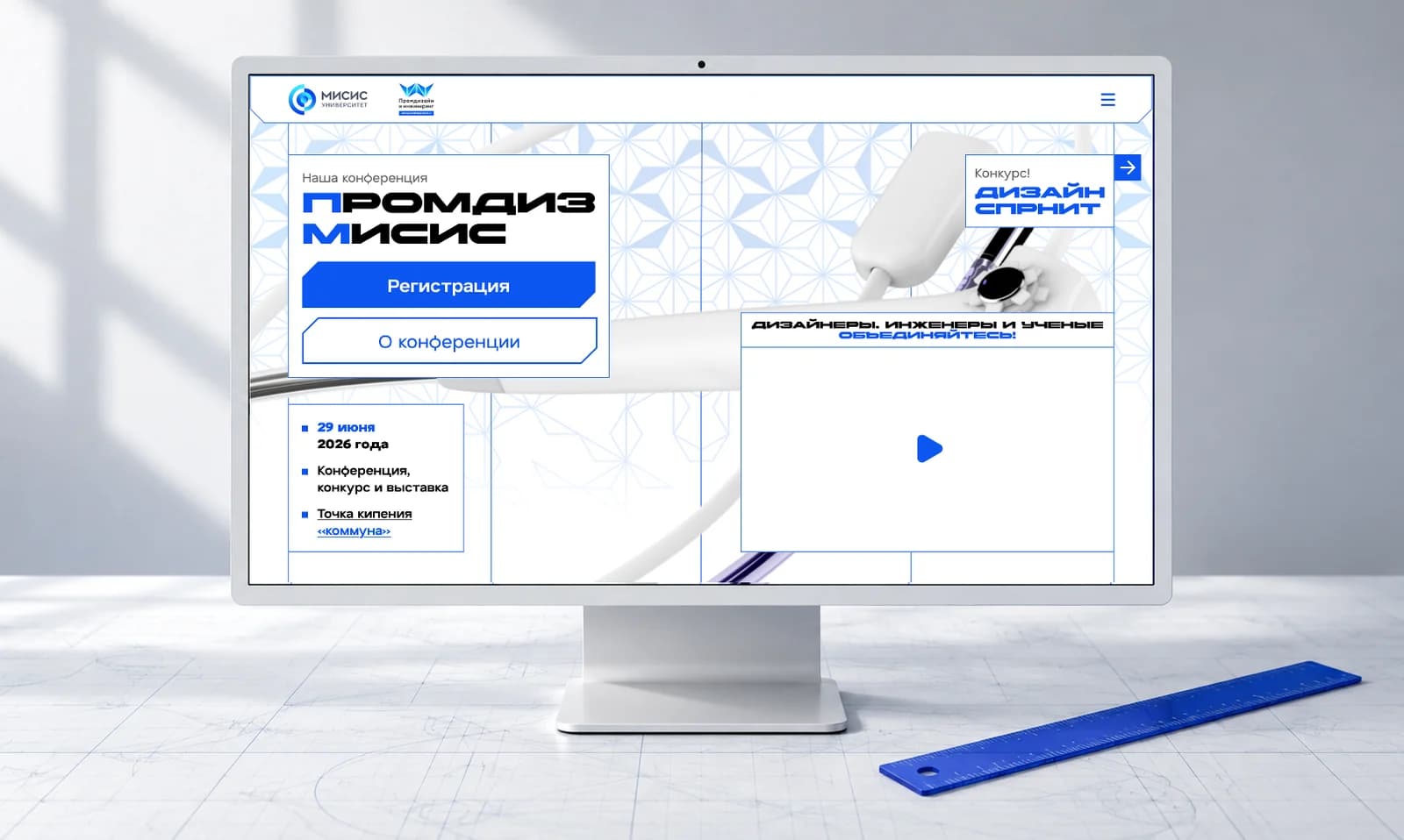
Promdiz MISiS
A redesign for NITU MISIS. The Industrial Design department’s “Design Sprint” site was rebranded to blend engineering blueprints with modern tech — a layout that feels drawn with a ruler and dotted with editing pop-ups.
Frequently asked questions
How much does a full website design cost?
A landing page starts at 60,000 RUB, a corporate site or online store at 120,000 RUB, and an account area or web app interface at 250,000 RUB. We count unique screens rather than pages: a catalogue of 500 products is one card template. Multiple languages, several user roles, complex tables, custom illustration and a dark theme all push the number up. We quote precisely once the screen list exists, which usually takes one 40-minute call.
What is the difference between UX and UI?
UX is structure and logic: which screens exist, the order a person moves through them, what happens on an error, where the path to purchase ends. UI is the visual layer: grid, type, colour, icons, button states, animation. You can validate UX on a black-and-white wireframe with nothing attractive in it, while UI without structure is just a set of pictures. On a real project one team handles both, almost always in parallel.
What files do I actually receive at the end?
The main artefact is a Figma file with edit rights on your account: pages for wireframes, finished screens at three widths, the UI kit and tokens in Figma Variables. On top of that you get a clickable prototype, assets in SVG and WebP, and a short rules spec. There is no PNG-only handover. The file belongs to you and another team can pick it up. On request we export tokens as JSON for Tailwind or CSS variables.
Do I need a design system for a small site?
A full documented system is overkill for a small site, but tokens and components are worth it almost every time. The difference is scope: for an 8 to 10 screen site that means 25 to 40 components and one set of variables, adding a few days to the schedule. It pays for itself on the first iteration, when changing an accent colour or adding a section stops meaning a rebuild of every layout. A dedicated design system project makes sense once a product passes roughly 50 screens with several people editing them.
How many revision rounds are included?
Two rounds of revisions are built into each stage: wireframes, visual concept and final screens. That is enough when feedback arrives as one consolidated list from the person who signs off. What gets expensive is different: reopening an approved structure after all screens are drawn, or changing the visual direction once the UI kit is under way. That is why we ask for written approval per stage and show progress every few days instead of once at the end.
Do you redesign existing websites?
Yes, and we start with diagnosis rather than mockups. We read the analytics and session recordings, find the screens where people drop out, and check speed and the mobile view. It often turns out the problem is a single form step or the catalogue structure, and a targeted fix costs far less than a full redesign. When a full rebuild really is needed, we roll it out in stages: home page and key landing pages first, then catalogue and product page, then the rest.
Want to talk it through?
Tell us what needs building. We will work through the task, propose an approach and send a staged estimate. No charge, no commitment.
Related services
- Branding, logo and visual identityWe build the visual system of a brand: positioning and naming through to logo, palette, typography and a brand book any future contractor can work from. You get vector source files, not just a PNG on a white background. We work with new companies and with rebrands, where an identity exists but has stopped doing its job.
- Website development, end to endWe build sites that still hold up a year later: from a one-page CMS build to a store or a web application on React and Next.js. One team for design, code, integrations and launch.
- Landing page developmentOne page, one goal: the enquiry. We build the landing around a specific offer and the traffic you plan to send at it, whether that is search ads, paid social, organic or email.
- Web app and Telegram Mini App developmentFor when a site is no longer enough and you need a product: an account area, a dashboard, an internal tool or a Mini App inside Telegram. We design the architecture, write the backend and frontend, and take it to release.
Terms used on this page
- Responsive designResponsive design is an approach where a single layout reorganises itself to the viewport: grid, typography and block order change at defined breakpoints instead of sending the visitor to a separate mobile version on its own subdomain.
- WireframeA wireframe is a rough screen schematic without colour, typography or imagery: it fixes which blocks exist, their priority and the transitions between screens, so the interface logic is agreed before expensive visual design starts.
- Design systemA design system is a set of tokens, components and usage rules that exists simultaneously in the design files and in code, fixing colours, typography, spacing and element states so that a new screen is assembled from existing parts rather than reinvented.
- Behavioural signalsBehavioural signals describe how users act in the results page and on the site: whether they click the snippet, whether they bounce back to search afterwards, how long they stay; Yandex uses them in ranking and penalises manipulation aggressively.
- Usability testingUsability testing is checking an interface with real people: participants from the target audience carry out realistic tasks while thinking aloud, and the team records where they stall, where they go wrong and what they fail to find.
- DiscoveryDiscovery is a one to three week pre-project phase that frames the problem, studies users and competitors, describes scenarios and constraints, and produces a prototype, a specification and an estimate with a justified range instead of a number pulled from the air.
Further reading
- Design Systems: When They Pay Off and When They Are an Expensive ToyMost teams asking for a design system need a component library and naming discipline instead. Where the line sits, how to calculate the payback before you start, and what actually belongs in a minimum viable version.
- UX Research Without a Lab Budget: What Actually Produces ResultsMost teams do not need a research department, they need to stop guessing. Methods ranked by cost and payoff, the five-user rule and its important caveat, and how to turn findings into decisions without a sixty-page report nobody reads.
- Redesigning a Site Without Losing Traffic: Stages, Risks and the SEO Migration ChecklistHalf of all redesign requests are really content, speed or offer problems. How to tell them apart, why a phased rollout beats a big bang launch, and what belongs in the migration checklist so the organic traffic survives.